
Get the Most Out of Your Edits and Prints
If you’ve ever edited an image to perfection on your screen only to receive a print that looks too dark, washed out, or overly warm, you’re not alone. Every monitor displays color slightly differently, especially if it’s never been calibrated. That’s why professional photographers rely on monitor calibration to get consistent and accurate results from screen to print.
This guide will explain why calibration matters, how to do it properly, and what to do next to ensure your monitor is showing you what the lab will print.
Why Monitor Calibration Is Important
Your digital camera doesn’t always capture what your eye sees, and your monitor doesn’t automatically correct that either. Even a high-end screen is still just guessing at what color “true white” is, or how dark “dark” should be.
Calibrating your monitor:
- Ensures your monitor is using a known color reference (a color profile).
- Aligns your screen’s brightness and white balance with standard photo printing conditions.
- Reduces surprises when you receive your prints.
- Gives you confidence when soft proofing for albums, wall art, or any client work.
If you’ve ever wondered why your prints seem darker than your screen, it’s often because your screen is too bright, not because the lab printed it incorrectly.
Calibration Isn’t About Perfection, It’s About Consistency
It’s important to know that monitor calibration is not an exact science. There are variances in hardware, screen technology, room lighting, and even your own eyes. The goal is approximation and consistency, not perfection.
The good news? Getting a consistent setup is very achievable with just a few tools and best practices.
Color Calibration, What You Need to Get Started
To calibrate your monitor, you’ll need:
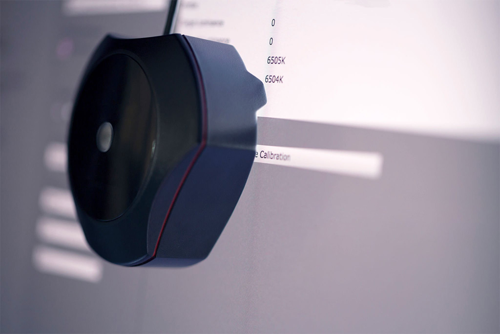
- A colorimeter, such as the X-Rite ColorMunki, Calibrite ColorChecker Display, or Datacolor Spyder.
- The included calibration software, or a tool like DisplayCAL.
- A display with brightness and RGB controls.
- A room with consistent, controlled lighting (avoid windows or constantly changing ambient light).
Note: Many laptops and inexpensive monitors can’t be calibrated accurately. Shared video memory or lack of color controls can limit your results. Mac users benefit from built-in calibration tools, but we still recommend a hardware-based solution for precision.
Recommended Calibration Settings
At ACI, we suggest the following basic targets:
- Gamma: 2.2
- White Point: D65 (6500K)
- Luminance/Brightness: 100–120 cd/m² (adjust to match your editing room lighting)
Gamma is a value that influences how contrast is displayed—2.2 is the standard for photography.
White point defines the color temperature of white. D65 mimics daylight, which is critical for editing images that will be printed under natural light or daylight-balanced bulbs.
Luminance varies depending on your space. Editing in a dim room? Go lower (around 100). Editing in a brighter space? Consider going closer to 120. Your screen should be the brightest object in front of you—but not excessively so.
Step-by-Step Overview to Calibrate Your Monitor
- Warm up your screen. Leave your monitor on for at least 30 minutes before calibrating.
- Connect your colorimeter and launch the software.
- Turn off ambient light adjustments in the software and your computer’s settings.
- Set your gamma, white point, and luminance targets.
- Follow on-screen instructions to position the colorimeter and adjust brightness/contrast.
- Create and save the ICC profile after the measurement process is complete.
- Set a calibration reminder every 2–4 weeks.
What Happens After Calibration?
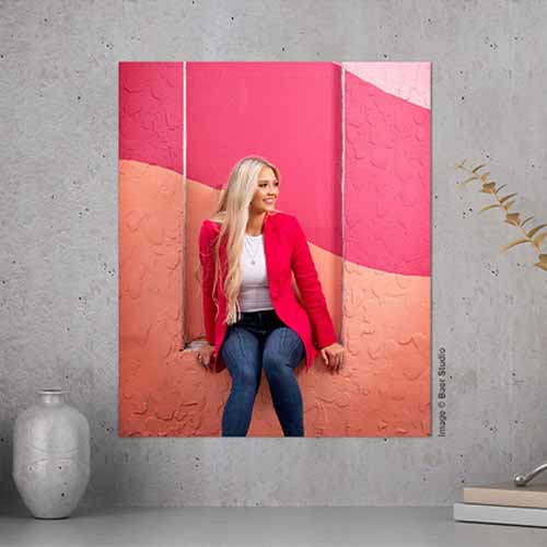
Once your monitor is calibrated and profiled, the next critical step is verifying how it compares to your actual prints. That’s where ACI’s free test prints come in.
Order Test Prints
From MyACI or Flex:
- Navigate to: Studio Color > Marketing Materials > Free Materials
- Choose the Calibration Print Template
- Upload an image you commonly edit
You’ll receive five printed samples back, including feedback from our color experts on how your image compares to lab-standard color. This side-by-side check is the best way to fine-tune your display for real-world output.
Still Seeing Issues?
Here are a few common reasons why your prints may still look off:
- Monitor brightness is too high: Even calibrated monitors can produce prints that look dark if your screen is set too bright.
- Prints look too warm or cool: Check your viewing light source. Use a daylight-balanced bulb (5000K) to review prints.
- Improper or no embedded color space (image profile): ACI recommends working in sRGB color space and embedding the working space in image files.
- Hardware limitations: Some monitors or laptops just don’t offer full calibration support.
Final Thoughts
Monitor calibration is one of the most important tools in a photographer’s workflow. It bridges the gap between what you see and what your clients receive, and it minimizes costly reprints or client dissatisfaction.
Need help or have questions? Our Customer Care team is always here to support you with color calibration, test prints, and best practices.
Give us a call Monday–Friday, 8am–5pm CST. We’re happy to help.